
In March 2020, Google announced that they would be moving to mobile-first indexing for the whole web. They planned to have this in place by September.
The search engine giant has been experimenting with mobile-first indexing since 2016. In 2019, they enabled mobile-first indexing for all new websites. The move to indexing the whole web this way was only a matter of time.
What does that mean for you as a website owner? If you haven’t already made your site mobile-friendly, now’s the time to do so.
Not sure how to get started? These five tips offer easy ways to improve your website right now.

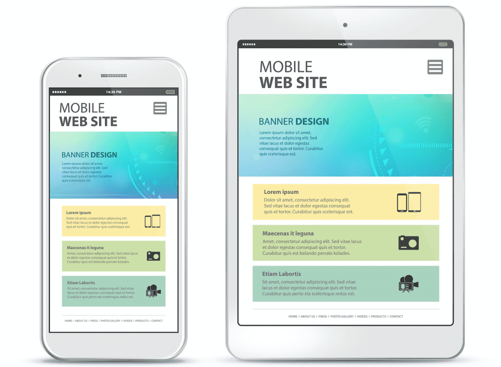
1. Choose a Mobile-Friendly Theme
The first step in making your website friendlier for your mobile visitors is picking the right design. If you’re using templates, you’ll want to look for a mobile-friendly WordPress theme.
How are designs built for mobile different? They’re usually more responsive, for starters. They have code written into them that lets them adapt to the user’s device.
This is known as responsiveness. It allows a website to resize for optimal display, no matter what size of screen your visitor is using.
The code behind the theme is usually “lighter” as well. Desktop machines usually have more stable Internet connections and more processing power. That means they can handle convoluted HTML, XML, and more.
A mobile phone can’t process this the same way, which can lead to lag or problems with display. “Lighter” coding on the back end means your site will load faster too.

2. Optimize Images and Code
Cascading style sheets, or CSS, are also part of the code on your website. They tell the user’s browser how to style page elements.
CSS can bog download speeds or lead to improper display the same way other code can. Optimizing CSS for mobile will ensure better display on all devices.
You should also think about optimizing images and videos. Images and videos that aren’t optimized often cause longer load times. Long load times lead to higher bounce rates and less visitor satisfaction.
Compressing images will make them lighter. Hosting your videos on a third-party website can also reduce load times.
3. Make It Easy on the Eyes
Another “make website mobile-friendly” change to undertake is reviewing the typefaces you’re using. How easy are they to read?
You need to test this out on several devices, with different screen sizes. Some fonts are legible even when they’re tiny. Others become much tougher to read.
You may want to bump up the size so that the typeface looks better on mobile devices.
Fonts may display differently on mobile, so check for legibility as well. Use bold and underline to make text stand out, instead of line breaks.
You may also want to consider an accessible font, which is easier to read for everyone. The increased contrast between letters makes the font easier for people with dyslexia. It can also help people viewing your site on small screens.
4. Use Mobile-Friendly Content
Now it’s time to focus on content. “Lighter” sites load faster, so you may also want to think about paring content back. Think about one or two optimized images instead of a whole gallery.
Keep in mind that you’ll also have less display space on mobile screens. What’s the most important information for visitors to see? You should foreground those details.
Anything else can be moved or maybe even taken off the page altogether. You may want to shorten forms to avoid scrolling. Also think about break up large chunks of text, which can look even less friendly to a mobile user.
Pay special attention to buttons and your calls-to-action. Buttons may need to be moved, so people on mobile can click them or won’t click them by accident. You may also want to resize the buttons, to improve display or highlight them.
Mobile-specific CTAs might include a “tap to call” button. This kind of call-to-action will take advantage of mobile device capabilities. These features may not be available on your desktop site.
Finally, there are some types of content you’ll want to avoid. Most mobile devices don’t support Flash, so it’s best not to use it.
Many business owners use PDFs for certain types of content, such as price lists or menus. This is frustrating for your mobile users. They’ll need to pinch in and out on their screens to be able to see the information they want.
Instead, turn these documents into live content your users can interact with easily. It’s a small step that will improve their experience a lot.

5. Test It Out
The final step to ensuring your site is ready for mobile-first indexing is to run a mobile-friendly test. Google offers a free tool, although there are others.
These tools let you check in on your site’s mobile-friendliness. In turn, they’ll also help you spot where you can make further improvements.
Using the report from the tool, you can keep tweaking and checking how mobile-friendly your site is.
It’s a good idea to keep one of these tools bookmarked. Testing and retesting your site’s mobile-friendliness over time is a good idea. As Google rolls out mobile-first indexing, the criteria for “good” mobile sites could change.
Best practices will evolve over time. You want to keep up with them so you can ensure you’re delivering the best possible experience to your visitors.
Get Ready for the Mobile Crowd
As the number of mobile users grows, it’s likely more of your traffic will be from smartphones and tablets. Making your site mobile-friendly now will help you prepare to serve all your future visitors too.
Are you looking for more ways to improve the website experience for your visitors? Teaming up with a digital marketing agency could be a smart move. Their expert team can help you design a new look, create consistent branding, and deliver the content your audience is searching for.
Ready to get started? Get in touch now, and see what a difference a better website can make.