In a world where it seems like every minute detail of your marketing content is subject to unbelievably intense scrutiny and analysis, sometimes the simple question of “how does your email actually look to the customer?” goes unanswered. While the substance of what ends up in customer inboxes is definitely the primary focus of any great promotional email push, if you don’t wrap it up in a visually pleasing package, don’t be surprised when it ends up in the virtual trash bin. To help you avoid this advertising calamity, let’s delve into the world of color theory and see just how important picking the right shades on the palette really is to the success of your brand.
What Is Color Theory, Exactly?
Of course for those of you who decided against the arts major in college, bringing up color theory might as well be like asking you how much you know about astrophysics. Thankfully, it’s really not that complex once you get the hang of it. The basic gist of the concept is that a color wheel defines the harmony between the colors, which in turn affects how people, like the readers of your emails, react to these choices. From here, creating an understanding of the connections between all of the choices on the wheel can add an extra layer of appeal that puts your brand imagery and content over the top with your audience.
Finding Balance and Harmony in Selections
Digging a little deeper shows that selections made via color theory start with evaluating sequential hues and shades found on the wheel, before branching off into three different approaches. The first approach focuses on analogous colors, or colors that stand side by side on the 12-part basic color wheel. Generally, the selections come in threes, with one color taking center stage for a brand’s color overall or email oriented color scheme. Additionally, pairing complimentary colors – or colors that exist as direct opposites in placement on the wheel – is also a popular strategy.Finally, it’s not unheard of to look to the natural world for a little guidance when picking a color scheme for your brand or upcoming email marketing initiative. This branch of color theory selection asserts that Mother Nature often comes up with the best or most visually striking combinations anyways, so why not take a page out her book and save yourself some time?
Is Color Theory Really That Important?
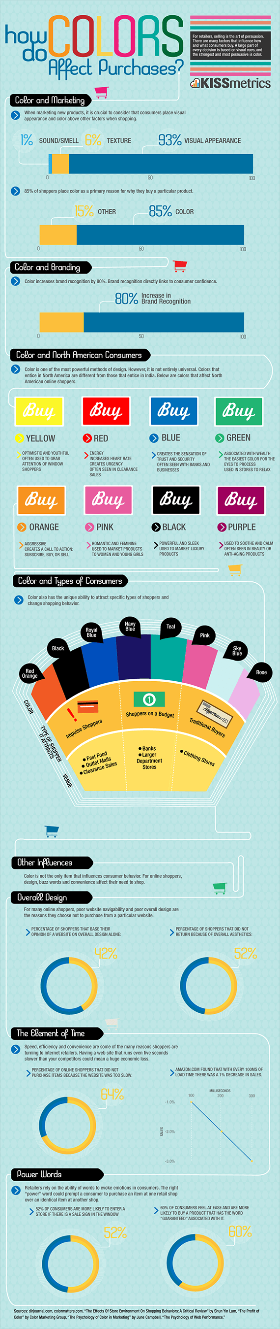
Now that you’re up to speed on how color theory works, the natural next step in the process is looking at why it works. At the heart of the argument for putting a little more thought into your color selections when creating promotional emails is the fact that 93 percent of customers claim that the visual appearance of a product or message is the top factor that goes into a successful marketing operations. On top of this, 80 percent noted that well designed and pleasing color selection increased brand recognition and visibility. Basically, if you can find the right colors for your brand and for your emails, you’re well on your way to hitting a home run with your customers.
Adding In a Little Psychology to the Mix
Aside from aesthetics, the selection for your next campaign can also send another, more subtle message to your viewers based on psychological tendencies connected to these colors. Yellow, red, and orange denote optimism, energy, and aggressiveness respectively, while green brings up elements of wealth and prosperity. On the other hand, purple and blue emphasize trust and security, with black representing new or sleek products. It’s important to note that these relationships coincide directly with North American consumers, and that different cultures and regions attribute varying characteristics to these same colors, so selections should take into account where your target audience resides.
Building a Strategy for Your Brand
The final piece to the puzzle comes with setting up a strategy that compliments and emphasizes what you’re messages have to offer to viewers. Naturally, there’s no universal selection that works for every brand, but you can build around general strategies that help refine your color selection based on what you’re trying to accomplish. For instance, retooling your entire brand image based on a more appealing color scheme isn’t a bad idea if you’re thinking long-term. Likewise, focusing on the next campaign and finding the colors that really compliment your promotional deals and products is just as worthwhile an endeavor. Regardless of how you approach the process, it’s hard to go wrong with retooling your brand and message look to create a stunning visual your audience can’t resist.